
I was responsible for the entire product life-cycle and user research on the apartmentratings.com "Write a Review Page" redesign. The role consisted of gathering product requirements, writing product requirements document and tickets, conducting usability test, launching A/B test and creating high-fidelity mockups.
Sketch JIRA Confluence Adobe Target Usertesting.com Marvelapp.com
Competitive & Comparative AnalysisUsability Testing A/B Testing
Reviews are the bread and butter of Apartmentratings. Renter can leave reviews about their experience for the apartment. Large quantities of renter's reviews are what make us unique from our competitors.

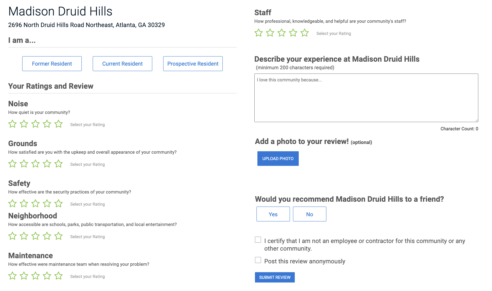
(Old Write a Review Page)

During the competitive research, we have noticed some websites are using the one-page approach, while others are using the multi-step format. This got me curious, what are the differences and which one is better for the Apartmentratings Write a Review page. After some exploration, we came across a couple of research One-page vs. Multi-step Checkout: Which to Use When? and Multi-step Form vs. Single-step Form: Which is the Best? to gather our pros and cons.
| One-page | Multi-step |
|---|---|
|
|
To find out exactly what our clients prefer between one-page vs. multi-step, we performed 15 user testings on usertesting.com. We first ask the participants to complete both the write a review process, then follow up with a series of questions.
For our hypothesis, we believed the multi-step would be a better layout for the Write a Review page. But according to our usability testing, the result it close to 50/50.
Since qualitative research couldn't provide enough information to prove our hypothesis, we decided to conduct an A/B test. By directing 50% of our users to the multi-step layout
and the other 50% to the current one page layout.
After a month and with close to 10,000 event actions, we concluded the multi-step layout is the winner with...
Below are the high-fidelity mockups I created for the handoffs to the developers. This design is also live on Apartmentsratings, try to leave a review on any apartment to view the entire process.
Our hypothesis was, by switching to Multi-step page format, it will give the user a better user experience which leads to a higher conversion rate. After completing the competitive analysis and user testing, the data did not shown enough distinction between the two formats, therefore we decided to conduct an A/B test. The data we received from the A/B testing clearly shows the multi-steps form out performed the single-step form, because of that, we could push the redesign into production with full confident.